

Interpreting (volatile) sequential analyses

Hi,
We have a dataset comparing 2 groups of participants (n ~ 350 in each group) on various structural MRI measures. Some analyses suggest moderate evidence for group differences, but I remain a bit puzzled by the sequential plots. We often have such plots:
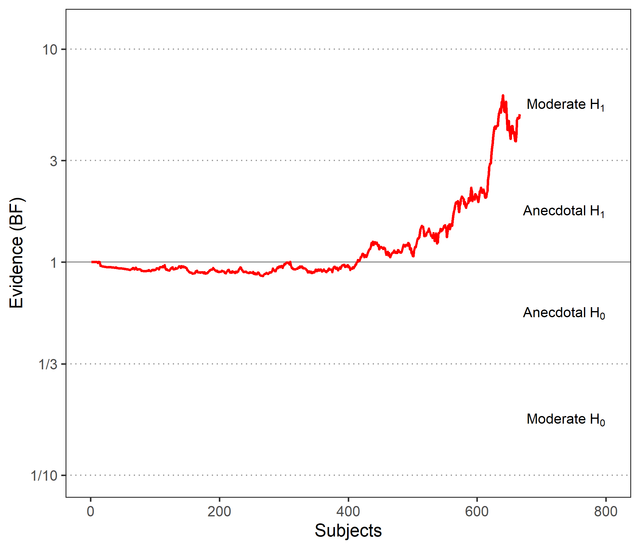
Here we have moderate evidence for a group difference, but I also understand from this graph that, had we restricted our analyses/data collection to the first 500 participants, we would have concluded that there is no evidence at all. Is this interpretation correct? If yes, I find that a bit unsettling and gives me little faith regarding claiming an actual group difference. Can someone enlighten me on this issue?
Alternatively, we sometimes have such plots:
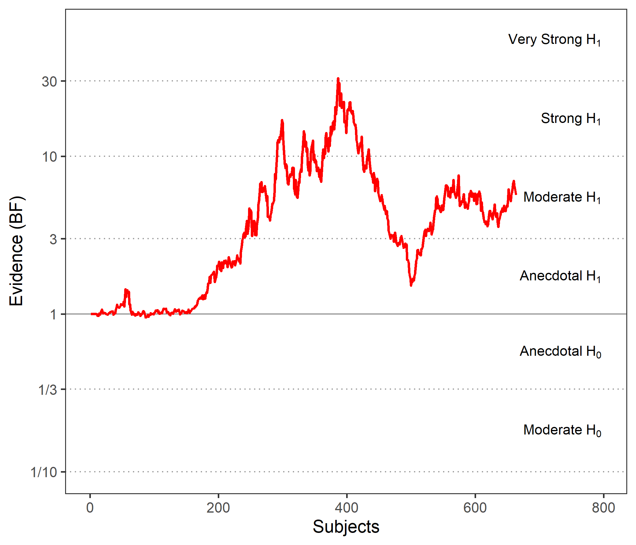
I find this even more disturbing: I may want to conclude based on the whole sample that there is moderate evidence for a group difference, but this plot suggests that stopping after 400 or 500 participants would have led to very strong vs anecdotal evidence, respectively. I find this sample-size-dependent "volatility" of the evidence quite disturbing. Should I be disturbed indeed? And thus cautious about any interpretation?
Thanks a lot in advance for your help!
All the best,
Guillaume
Comments
Dear Guillaume,
These look a little unusual indeed. For the first graph, it is strange that the BF hardly changes from 1 until after about 400 data points are in. What sometimes causes these graphs to look strange is that the first n rows feature only (or predominantly) participants from a single condition, so that not much is learned about the difference between conditions. The downward slope in the second graph could also be due to batch effects in the data -- it isn't the case that a different analysis method or something like that was used, right?
Cheers,
E.J.
Dear E.J.,
thank you so much for your quick reply!
The underlying data has indeed an unusual structure, sorry I forgot to mention it. The whole (structural MRI) dataset is actually composed of 12 smaller datasets acquired in the context of 12 different studies that we pooled together. So there is heterogeneity (in terms of sample size, acquisition parameters/MRI scanner, stringency of inclusion criteria...), which could create such batch effects. Note that we have used Combat to counter-act this heterogenity the best we could.
Now knowing this, do you think it could explain the above graphs ? I.e. the top graph would suggest that only a fraction of the datasets provide evidence for a group difference? In that case is it fair to make a claim of a group differences by just reporting the Bayes factor of the whole dataset, i.e. BF10=5 (somehow seems wrong to me)?
And in the bottom graph, could this mean that various datasets provide evidence in opposite directions, in which case I would also feel uncomfortable reporting an "overall" group difference based on overall BF?
Final question: this makes me realize that the order of participants is obviously a key driver of the shape of these sequantial plots, right? If yes, would it make sense to randomize their order?
Thanks again for your thoughts, much appreciated!
Best,
Guillaume