

Interpretation Smoothed Regression in Scatterplot

Hi everyone,
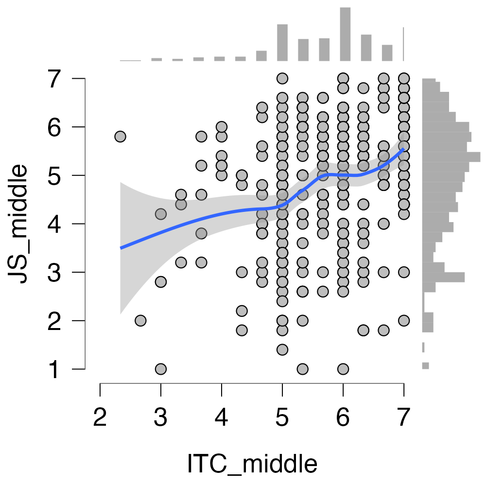
I am struggling to interpret the above scatterplot, maybe someone of you can support me.
I am looking at the Intention to comply (x-axis) and job satisfaction (y-axis) and trying to understand whether there are turning points, i.e. if job satisfaction is decreasing when ITC is too high.
If I understand the plot correctly it shows me that the effect of ITC on JS starts slowly, speeds up, and then slows down again.
Could someone assist on how to correctly interpret the graph?
Highly appreciated, thank you! 😊
Comments
Hi Birte,
I think you are reading too much into these undulations. If you want to study the precise nature of the relationship I would try polynomial regression with model selection. It looks to me that you will find evidence for a linear relationship but not more than that. Also, it seems that your measurement scale is discrete, so that the scatterpoints overlap and will not give a good impression of the density.
Cheers,
E.J.
Hey E.J.,
thanks for your help!
The scale is metric. However, the data is based on a survey using a 7-point-Likert-scale.
Tbh my supervisor mentioned that I should analyze the turning points so I am probably just trying to interpret something into them but guess the relationship is just linear. Thanks!