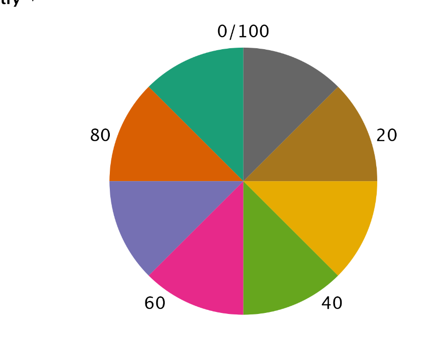
Pie Chart Won't Calculate % correctly
I have a small table with two columns - one nominal variable (just some country names) with a scale (some numbers associated with the country). I am trying to create a pie chart to show what % of the total is each country but I'm not able to calculate the correct % for the pie chart. All the sections of the pie are the same size. Excel is able to do it but I want to know how to do it in JASP.


Comments
Hi @newjaspuser ,
The pie chart you create is based on a single column, where it looks at how frequently each value occurs. Since you have a separate column that indicates the counts, it is unfortunately not possible to create a pie chart in descriptives.
If you want to visualize the counts, using a count variable, then there are two options:
Sorry that there is not a better way of doing it for now - we will work on a more elegant way of handling counts variable in future versions with more elaborate data editing.
Kind regards
Johnny