

Scatter Plot

Hi everyone,
I would like to know if it is possible to obtain a Grouped scatter plot in Descriptives module?
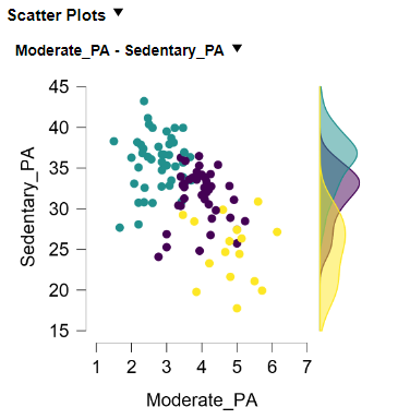
I performed a K-Means Clustering analysis, but I would like to represent the distribution of the clusters, as well as their density, for each variable.
Therefore, I wanted to "join" both the attached plots.
Thanks in advance,
Mateus

Comments
Sorry about the delay, I'll ask
E.J.
Looking forward to hearing from you EJ.
Thanks.
Hi Mateus,
I'm having a little trouble understanding what kind of plot it is that you desire. From your second plot, it seems like you have already obtained a grouped scatter plot that represents the distribution of the clusters, as well as their density, for each of the two variables. You can also add a density plot on the top of the second plot (in Descriptives).
I'm probably interpreting your request wrong though, so maybe you can provide a little more explanation about the type of plot you desire?
Best,
Koen
Hi Koen,
First of all, I am sorry for my late response. Furthermore, thank you for taking the time to write to give me some feedback.
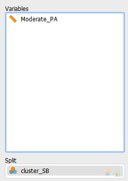
I would like to create a plot representing the distribution of the clusters, as well as their density, for just one variable (please, see the enclosed picture).
I look forward to hearing from you.
Thanks in advance,
Mateus
Hi Mateus,
I understand what you mean now! I actually don't think you can currently make the exact plot that you want in JASP. However, there are some ways in which we can cheat ourselves to something very similar. The first alternative I guess would be to make a Violin plot of the variable Sedentary_PA split by cluster_SB. You can do this by clicking the boxplots box, disabling the boxplot element, and enabling the violin and jitter elements. The violin plots give an impression of the distribution of the values in each cluster (see image below). These plots can be found in the attatched .jasp file and come from the Iris data set.
Another alternative is a bit more hacky. You can create another variable inside jasp that is basically a copy of the cluster_SB variable (e.g. cluster_SBcopy). Then you can put the variables Sedentary_PA and cluster_SB into the descriptive statistics analysis and split by cluster_SBcopy. Then you can create a scatter plot with no density or histogram above the plot, and a density plot to the right. Disable the regression line and the legend and this is what you will end up with.
Download this jasp file for the examples using the Iris data set:
https://drive.google.com/file/d/1Ow4WmJ6GPYQuFLW4YUDvRwAIYVimAw4J/view?usp=sharing
Hope this helps!
Koen
Hi Koen,
Only now, I notice that last month I forgot to thank you.
I was a good "hacky" solution, as it solved my problem 👌
Thanks again.
Mateus