

about the descriptive plots in JASP

Hi, I am using the JASP to plot the descriptive results of my data. And it seem create the value of y axis range automaticly.
For example, I plot two figure in JASP, shown as below:
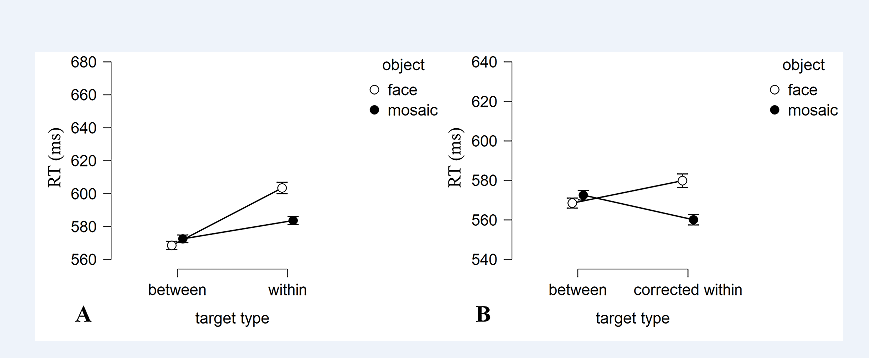
But I hope these two figure can share the y-axis range.
if there any way to achieve this in JASP?
Thanks!
Comments
Yes, you can achieve this using the "edit image" option!
See https://jasp-stats.org/2021/09/21/introducing-jasp-0-15-new-languages-basic-plot-editing-raincloud-plots-and-more/
Cheers,
E.J.
Thank a lot!I can edit it now! @EJ
Is there a place to find out about the choices JASP makes in plotting?
I need help figuring out the new HEAT map function (since .16). Haven't figured out how to make it work.
Also I would like to know why JASP doesn't produce bar charts (with error bars) only line graphs. Most data in my area are not continuous so the line graph is misleading. I like the new raincloud charts, but would like to show students the same results across several formats. Bar charts (Where I can set the y-axis to 0) are particularly useful in helping students understand results in large datasets that are significant but trivial. The line graph emphasizes the difference (and won't let me change the y axis to 0 even with new editing capacity.
Thanks
Paula Marentette
And I now see this is in the wrong place (Plots AND Bayes Factor). I'll try to locate the right place.
I've just responded (in that right place)