

Frequency Plot for categorical data

I have a dataset where bullying (yes vs no) is dependent on gender (man vs woman). I want to create a simple frequency plot that shows bars for the percentage males and females that experienced bullying. However when trying to create this via descriptive statistics --> frequency plots --> seperate frequencies for gender (type = histogram). This plot only works if my variable 'bullying' is continuous. As seen below:
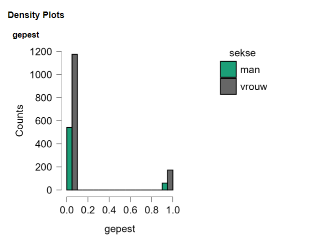
0 means not bullied and 1 means experienced bullying. I want this plot but then not on a scale from 0.0 to 1.0, but with my original categorical data... Is there a way to make this work in JASP? If my variable type is nominal the frequency plot fails to show up.
Comments
Hi Marissa,
Sorry about the tardy reply. I will make some inquiries
Cheers,
E.J.
Hi Marissa,
If you change the data type from scale to ordinal or nominal then the x-axis reflects the discrete nature of the data:
You can click the icon next to the column name to change the type per analysis:
the * indicates that the variable has changed its type relative to how its type in the dataset, and hovering over it shows how it was transformed.
Hope that helps!
Cheers,
Don
Thank you, @vandenman This is a crucial response. I encountered a similar issue in the past as well.