

Urgent help to plots would be appreciated

Due to a submission deadline this evening, I have a newbie question and would appreciate your quick help regarding the plots in the "paired samples t-Test" section of JASP with my settings?
- are means or medians shown in the boxplot?
- the box shows the interquartile range?!
- the whiskers show the standard error?
There is no possibility to change the figure to grayscale? (if not I will post-process it in powerpoint)
Changing the range of the y-axis seems not to work when editing the image.
Your help is appreciated so much!
Comments
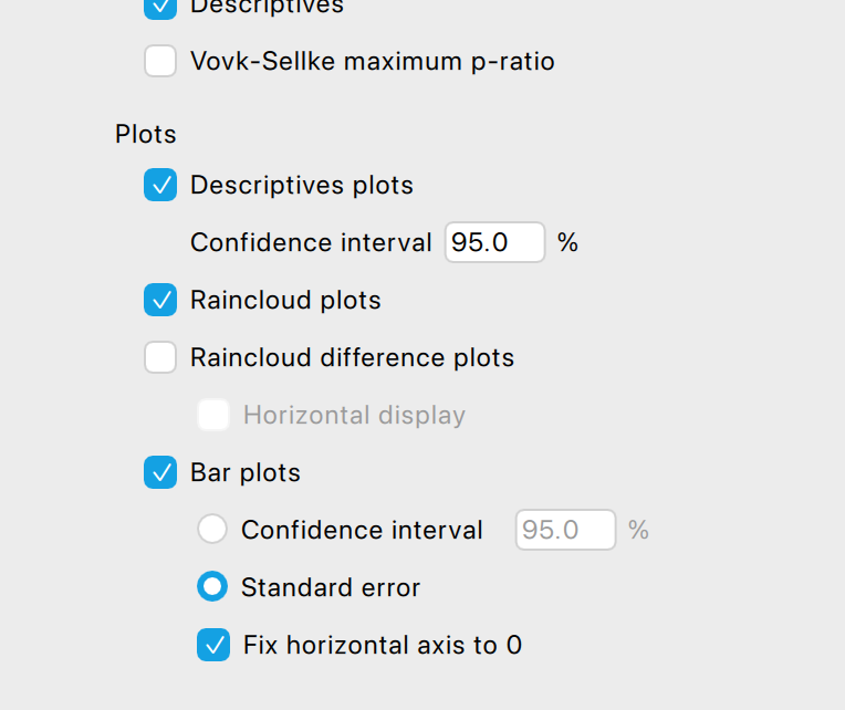
May I recommend going into Descriptive Statistics --> Customizable Plots --> Boxplots (in colorblind color palette) to address all of your concerns in one fell swoop?
FYI. This graphic describes the elements of a box plot: https://cdn1.byjus.com/wp-content/uploads/2020/10/Box-Plot-and-Whisker-Plot-1.png
R
@Dmartin427 and @andersony3k
Thanks to both of you. This helped a lot!
Do you think I should do a feature request on the github page for enabling "customized plots" (color set, min/max of y-scale, rotating the labels for the x-axis) for the t-test section? Currently it's indeed only available for the descriptive statistics section, but would make sense to have it in all plots?
@andersony3k thank you for the link. in your graphic the whiskers are showing the minimum and maximim values (or am I wrong)? But according to JASP, see screenshot above, they would show the SE?! I assume this is not the same, or am I wrong. Furthermore as far as I know there are boxplots that show (additionally?) the mean and not (only?) the median. I know this are basic statistics knowledge and if this here should not be the apprpriate forum to ask this please feel free to let me know.
Also, you might want to check out our raincloud plot functionality, which offers a lot of customization.
There is an accompanying 1.5 hr video on our YouTube channel...
EJ
@vinschger
Usually, and in JASP: If the data maximum is not greater than 'the 75th percentile plus (1.5 times the interquartile range)', then the upper whisker extends to the data maximum. Otherwise, the upper whisker extends to 'the 75th percentile plus (1.5 times the interquartile range)'. Likewise, if the data minimum is not less than 'the 25th percentile minus (1.5 times the interquartile range)', the lower whisker extends down to the data minimum. Otherwise, the lower whisker extends to the 'the 25th percentile minus (1.5 times the interquartile range)'.
The box's center line is the median.
You will sometimes see the mean added, in the form of a large dot, but that is not usual (and I don't think JASP'S box plots include that option). As referred to by @EJ, above, you can use raincloud plots (in Descriptives) to present a violin (rotated, smoothed histogram) along with either a box plot or a mean with SE bars.
If you absolutely need to show both means and medians together--especially if you're a beginner on a tight deadline--I would suggest creating two separate graphs and then presenting them side-by-side: (a) a rain cloud graph configured to show the point cloud, mean, SE, and smoothed histogram, and (b) a box-plot graph.
R
Thanks to all of you. I used the plot in the t-test section because it provides a view where paired cases are shown with connecting lines. As far as I understand, such a figure is not easily or directly achievable in the descriptive plots section. Afterwards, I modified the colors to grayscale and adjusted the overlapping x-axis labels in PowerPoint.
The plots in the t-test section lack color editing. Wouldn’t it make sense to add this feature for all plots in JABS? Additionally, adjusting the y- and x-axes (e.g., the ability to define min/max values for the y-axis and set tick scale/intervals) would be useful.
Would it make sense to submit these suggestions as feature requests in the GitHub forum?
The feature request to include the p-value directly in the figure has already been submitted there.
Did you notice the graph editor? For most graphs, "edit image" (activated upon clicking the small black triangle on top of each figure) allows you to define the ranges and ticks on the axes.
Cheers,
EJ
@EJ
1) yes, I know. but when changing the limits in the edit something strange happens to the raincloud plots, see screenshot. or is this expected behavior?
2) Furthermore, color changes are only possible in the descriptive plots, not in the accompanying plots to the t-test. Should I submit this as a feature request?
3) As far as I have understood tick intervals cannot be adjusted in the edit plot settings.
4) Isn't there a lot of redundancy in such a figure (showing single cases, box plots and raincloud plots) or is this a combination that you often use in your publications?
5) The median value is shown with a really thick line, especially in my first screenshot, see above. Any reason for this from a statistical point of view?
@vinschger
You have to use variable names, in your data, that are short enough so as not to overlap in your plot, or you have to use the raincloud plot in 'Descriptives' and adjust the dimensions of the plot.
The interface for adjusting the tic intervals is there, in your screen shot.
Single case are not redundant with summary information. The whole point of the raincloud plot is to include all of the non-redundant information so as to present a more complete picture of the results.
The reason the median line is thick is to visually distinguish it as the median. This a a standard way to render box plots.
R
@andersony3k
thank you so much. this helped a lot.
but if you have a look at the raindrop plot in my last screenshot. the plots are not in the right position to the y-axis, they seem to be rotated. this happens after changing the limits of the y-axis. is this normal behavior?
@vinschger no that looks like a bug. Please report the rotated densities on our GitHub page (see https://jasp-stats.org/feature-requests-bug-reports/)
@EJ I have now reported the bug on github https://github.com/jasp-stats/jasp-issues/issues/3147
Thanks!