

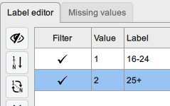
Changing color order in the Plot Builder (JASP 0.95.4) - Order mismatch between graph and legend
Hello,
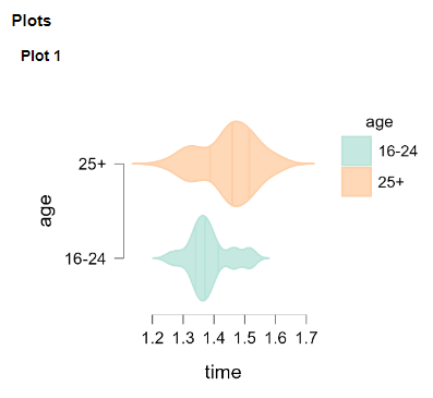
When I create a violin plot with an X-Axis variable and an Y-Axis variable in the Plot Builder (beta), there is a mismatch of the color order in the graph vs. the legend.
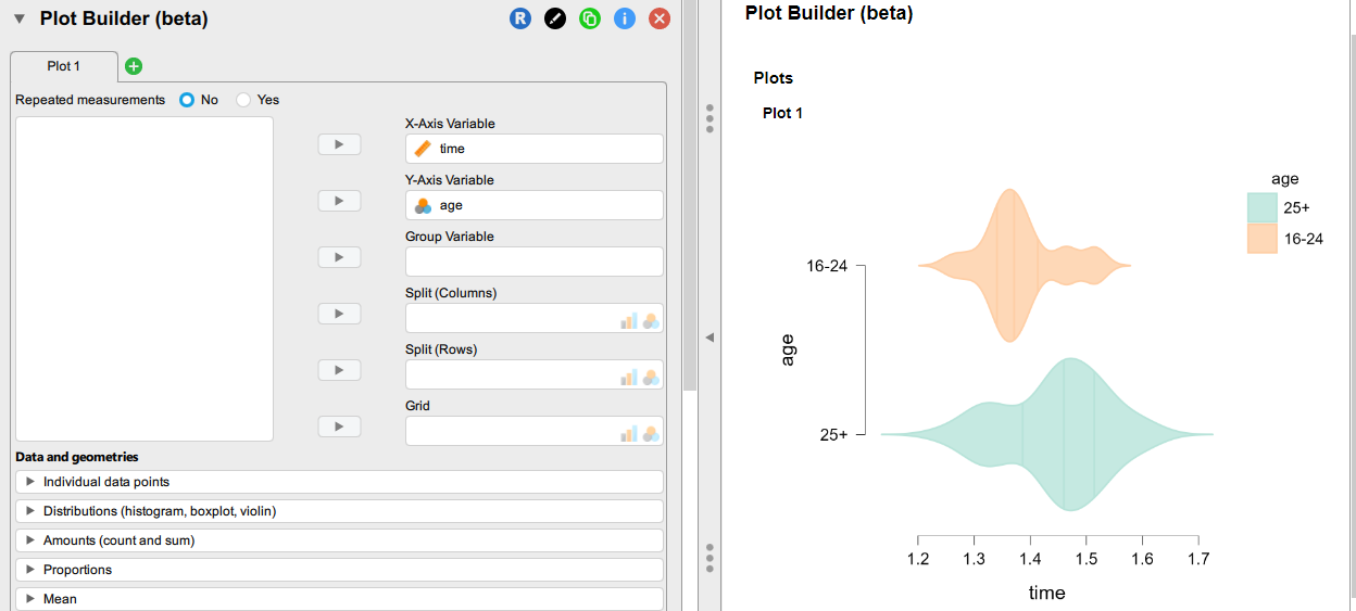
I tried switching the two age categories in the GUI, but that does not solve the problem.
Is there a workaround ?
The sample data file is attached.
Regards,
Comments
I don't see a problem with this personally. I think that the real cause for this here is your y variable is nominal.
In any case, I don't see a problem here personally. These graphs are very clear and legible.
While I agree this is a minor annoyance, I would like to get that result, which would be more legible:
I can see why one might want the order to be consistent. On the other hand, the legend doesn't actually belond there since it duplicates the infirmation that's already on the vertical axis. So I think the work-around--which actually makes the plot clearer--would be to simply remove the legend.
R
Agreed! And note that if you save the image as pdf or pptx, it can be further edited in another program.
Please note that this image is just an example. The legend is sometimes more detailed that what appears on the Y-axis (limited space). Furthermore, when there are several groups, when the legend is not aligned with the color assigned to the groups, this is not the best. Thanks for mentioning the possibility to edit the image in another program, but if that could be done directly in JASP that would be better. I know that an alternative would be to remove the legend and to add a note under the figure to detail the meaning of the groups.