

Meaning of error bars in JASP's QQ plot?

Hi all,
I'm analyzing reaction time data in JASP. JASP makes it very convenient to check my data for normality by providing the QQ plot against a normal distribution. I noticed that the plotted data points all have error bars around them. This is in contrast to what I have seen in R's qqnorm function.
What do these error bars mean?
Can I use them to help me in this (sometimes quite subjective) decision whether or not my data are normally distributed?
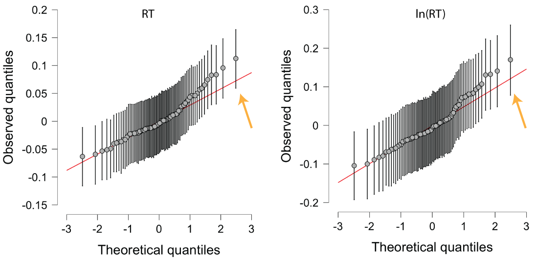
Example: I have attached my QQ plots. On the left you can see that there is a deviation from normality at higher values. This is to be expected because RT data typically have longer tails towards the right. I took the natural logarithm of the RT and examined how that changed the QQ plot. If you look at the right-most data point indicated by the arrow, you can see that it has slightly moved closer too the line. The read line is now more comfortably within said error bars. Does this mean that the transformation has made the data more Gaussian? Are the untransformed data already "Gaussian enough" since the error bars already include the red line?
Cheers,
Michael
Comments
Hi Michael,
Cheers,
E.J.
Dear E.J.,
Thanks for your time!
I was hoping that this might be some sort of highest density interval for believable values that the JASPers had kindly included to facilitate people's judgments.
Cheers,
Michael